
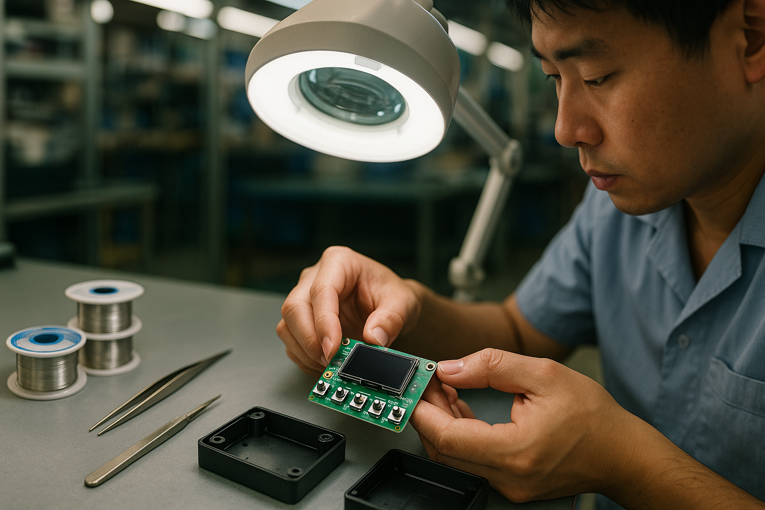
Quick question: Where should buttons, LEDs, and screens go and why does button LED screen placement matter?
Button LED screen placement is a decision about how people will hold and use your product, and it shapes usability, waterproofing, repairability, and the schedule for prototypes. Make the choice by naming the user outcome you value most, and let your manufacturing partner translate that outcome into a validated layout.
Which option gets my product to market sooner for button LED screen placement?
Simpler user interfaces tend to reach a first prototype and functional trial faster. A single front panel with the screen, one or two buttons, and status LEDs visible together reduces custom parts, shortens assembly steps, and speeds early testing. If your priority is speed to market, favor a compact front-panel layout that follows common hand positions.
Distributed controls, with buttons on several edges or LEDs routed through channels, add alignment and assembly steps. Those extra steps are not bad, they just take more time to validate. A product owner who chooses a distributed layout trades longer early development for a finish that better matches a particular industrial design or ergonomic goal.
How do button, LED, screen, and light pipe choices affect assembly and repairability?
Placement choices change how the product is built and how easy it is to service. A PCB (printed circuit board, the flat board that holds and connects electronic parts) with LEDs exposed through small windows can be fast to assemble and simple to rework. Using a light pipe (a molded plastic channel that directs LED light from the board to a surface) keeps internal layouts tidy and gives a consistent external look, but it adds parts and an alignment step during assembly.
If you need faster assembly and simpler on-site repairs, choose layouts that expose LEDs and keep buttons in modular subassemblies. If you prioritize a consistent finished appearance or need LEDs positioned away from the board, light pipes are a good fit. For buttons, sealed membrane interfaces reduce assembly steps and improve waterproofing, while separate mechanical switch modules make field replacement easier. These are tradeoffs you make in terms of schedule and serviceability, not technical hurdles.
| Approach | When to pick it | Time to market | Repairability |
|---|---|---|---|
| Simple front panel – screen plus exposed LEDs and 1-2 buttons | When you need a fast prototype and clear UX | Faster | Lower, unless modular assemblies used |
| Distributed controls – edges and light pipes | When ergonomics or industrial design demand specific placements | Moderate | Moderate, depends on service access design |
| Sealed interface – capacitive or membrane buttons with sealed screen | When waterproofing and smooth surfaces are highest priority | Longer due to sealing and validation | Higher service complexity, needs planned access points |
How do accessibility, tactile feel, and waterproofing influence placement choices?
Place controls where users naturally reach and where they can find them by touch. Button LED screen placement should follow hand positions and common left or right-handed use, and controls should have clear visual contrast for readability. Tactile options affect feel and sealing: mechanical travel gives clear feedback but needs a housing cutout and sealing strategy, while capacitive or membrane controls are thinner and easier to waterproof but give less physical confirmation.
If waterproofing is a priority, pick smooth surfaces and sealed modules so everyday users get splash and dust protection. If serviceability matters, plan sealed subassemblies that technicians can access through a service panel. These choices are about balancing user experience with the maintenance model you want for the product.
How is the layout decision validated in a real build?
The practical sequence puts the user decision first, then proves it quickly in physical form. Start by choosing two layouts that match your prioritized outcome, for example speed to market or waterproofing. Build simple enclosure mockups so stakeholders can evaluate reach, button feel, and screen visibility. Then assemble a labeled prototype PCB into that enclosure to confirm alignment of LEDs, any light pipes, and the screen angle.
Early physical checks catch alignment and fit issues before a production trial. A short loop of mockup, functional prototype, and one revision is usually enough to confirm the chosen button LED screen placement works for real users. The manufacturing partner handles sequencing, parts sourcing, and the prototype run, so your team can focus on product decisions and user outcomes rather than assembly details.
How small layout changes affect usability in practical terms?
Minor shifts in control placement change how quickly users understand device status and how reliably they operate it. For example, moving the main action control a little closer to the thumb often reduces accidental presses and improves one-handed use. These are decision-level tradeoffs you can validate with quick mockups and short user trials, not long engineering cycles.
Practical next steps, who does what, and how we support the work?
Decide which outcome matters most to your users, for example speed to market, waterproofing, or ease of servicing. Request two layout concepts that reflect that priority, and include tactile samples and a simple prototype run so stakeholders can try the controls and confirm LED visibility and screen readability. The partner coordinates enclosure mockups, a labeled PCB for fit checks, and a short prototype iteration so alignment and sealing details are resolved early.
When you are ready, start with a short call and share your product goals. The team will translate those goals into two recommended placements, schedule a prototype review, and confirm the parts and assembly steps that match your priorities. If you want examples of accessibility guidance for digital and physical interfaces, see the W3C accessibility resources at W3C WAI.
FAQ
Where should I put a power LED on a handheld device?
Place the power LED where users naturally look for status, typically near the main screen or the primary control. If it must be visible without looking directly at the device, put it on the top edge or behind a diffusing window so the indicator reads clearly at a glance.
How do I make buttons feel satisfying without hurting waterproofing?
Choose sealed button modules or membrane switches when waterproofing is critical. If you need tactile feedback, select sealed mechanical switches or design a sealed dome that transfers travel to the switch beneath. Prototype both so you can feel the difference and pick the best tradeoff for your users.
How does button LED screen placement affect testing and validation?
More complex placements, like those using light pipes or distributed controls, require additional alignment and visibility checks. Simple front-panel layouts reduce the number of product-specific assembly and functional tests. Either way, the validation sequence is short and focused: mockup, functional prototype, then a single revision to confirm the layout.
Are there rules I should follow for accessibility and reach?
Yes. Use clear visual contrast, reachable button positions for users with limited dexterity, and predictable layouts. The W3C accessibility guidance can help translate digital accessibility principles into physical layout decisions for screens and controls.
Ready to pick a layout that matches your timeline and user needs? Contact Shenzhen Futurezen Co. Ltd. or visit our services page to schedule a prototype and layout review. We will prepare two layout options and a short prototype plan so you can validate button LED screen placement with your team.